NEECCo (North East England Climate Coalition)
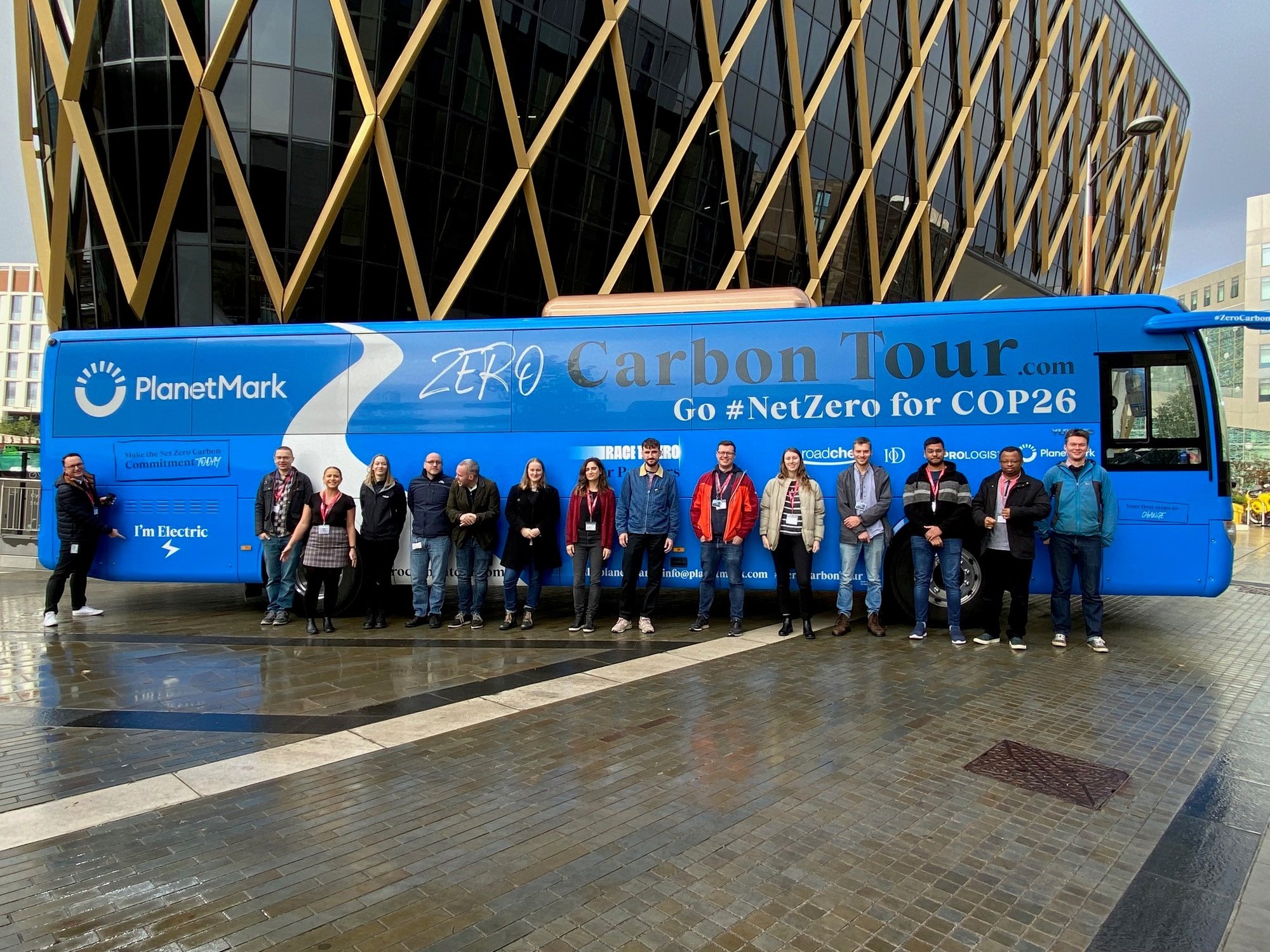
Image: DataJam North East Data vs Climate Change Hackathon, 2022.
The organisation
Founded in 2019, NEECCo (North East of England Climate Coalition) was created as our region's initial contribution to the urgent, radical and at scale response demanded by the climate emergency with an aim to transform the North East into England's most environmentally sustainable region. As a collaborative initiative across various sectors, NEECCo aimed to ignite a passion in everyone to build a brighter and sustainable future.
The emergence of NEECCo was driven by the need to enhance the North East's significant role in responding effectively and extensively to the pressing demands of the global climate crisis, for the benefit of future generations.
For the last 35 years Chris Ford has worked doing freelance research and development work for voluntary organisations and community groups in the North East. Chris was contracted by NEECCo on a consultancy basis which included leading on the ‘Indicators Project.’
In early 2024 NEECCo ceased to operate with the work being taken forward by two Local Authority led subregional partnerships – one covering Tees Valley, the other covering the new North East Mayoral Combined Authority.
The indicators project is now part of Going Green Together.
The problem
NEECCo started with a mission to address the climate emergency, ecological breakdown, and the necessity of a just transition. The organisation identified the need for a set of clear, simple, and replicable indicators, using publicly available data to gauge regional progress in climate action. These indicators were designed to align with the regional carbon budget and the triple bottom line approach, ensuring a fair transition.
During CoP26, which was held in Glasgow, NEECCo and the National Innovation Centre for Data (NICD) hosted the Data vs Climate Change Hackathon to test initial ideas. Participating teams in the two-day hackathon included Sage, the event's sponsor, along with Bulien, students from Gateshead College, and a mix of professionals and students. Together with NICD data scientists, they focused on developing innovative dashboards.
The outcome of the hackathon helped to quickly validate NEECCo’s assumptions about the project, as well as answer and raise additional questions to inform the dashboard project with NICD. These were further tested and refined through a Challenge run by Analysts Network North East (ANNE), the regional branch of the Operational Research Society, and NICD.
NEECCo’s indicator project synthesises five key aims into actionable metrics:
- Managing the climate emergency through adherence to the Tyndall Centre's carbon budget.
- Mitigating ecological breakdown by monitoring regional natural asset changes.
- Fostering the greening of our economy.
- Altering behaviours to mitigate the threats of climate change and promote health and well-being.
- Ensuring a just transition that rectifies societal inequalities while addressing environmental challenges.
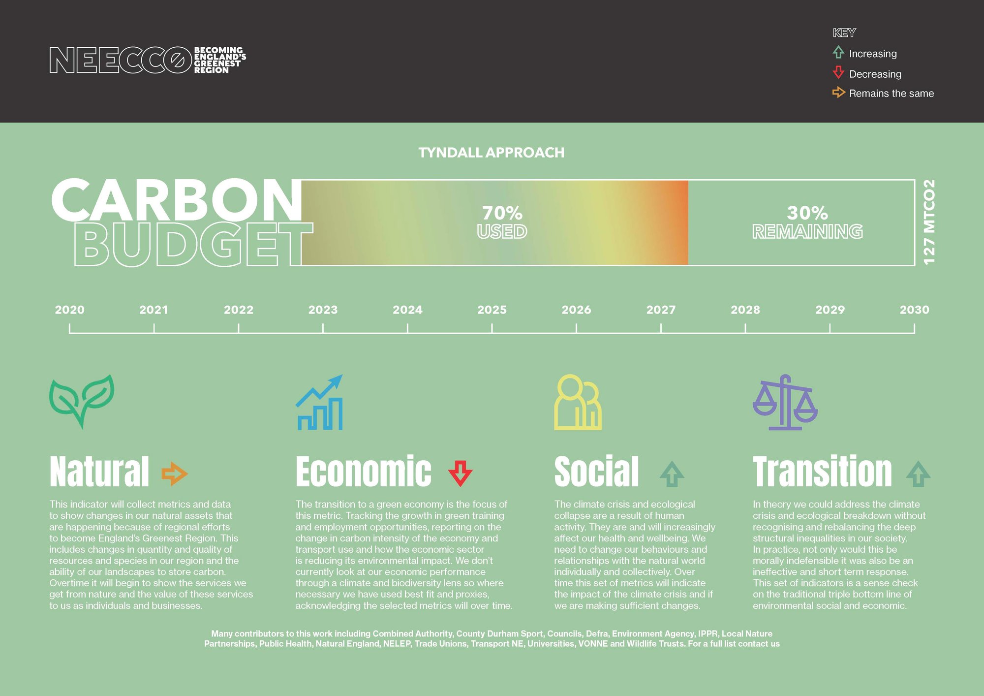
Image: Mockup of Indicators Project dashboard. Credit: NEECCo.
The goal
To develop a dashboard that clearly displays greening indicators, enabling public understanding and participation in regional climate efforts.
"The tool is about informing and helping people... engage with the most fundamentally difficult issue that we face and making informed choices and changes in their behaviours."
Chris Ford, Consultant, NEECCo
The result
The collaboration between NEECCo and the National Innovation Centre for Data (NICD) led to the creation of a comprehensive dashboard, of which some visualisation ideas were workshopped during the Data vs Climate Change Hackathon.
Implementation
To address the client's specific needs, NEECCo sought to present a visual representation of datasets reflecting their core aims, including the development of a dashboard for various indicators. In addition to the 'headline' set of indicators relating to carbon, these indicators were grouped into four categories, each containing three sub-groups, with one to five indicators in each to be visualised.
A mock-up of the dashboard with indicators, context and associated metrics was created by NEECCo. The National Innovation Centre for Data communicated with the client to ensure the initial ideas were possible to visualise and provided guidance on data source gathering. Initial work also included wireframing to create a layout for the dashboard and ideating on the narrative and colour selections would best communicate NEECCo’s vision for the tool.
Once datasets were gathered by NEECCo, the National Innovation Centre for Data team worked through them and proposed suitable visualisations and iteratively reviewed any discrepancies.
After several iterations, the teams settled on the definitive version of the dashboard. The dashboard was containerised for deployment, ensuring a user-friendly setup. The National Innovation Centre for Data conducted training sessions, focusing on empowering NEECCo's team with the necessary technical skills for updating the dashboard and deployment strategies for sharing it with stakeholders.
The resulting outcome is an interactive Plotly Dash dashboard deployed within a Docker container, fulfilling the project's goals within the allocated time.
This has provided NEECCo with an expandable platform that can be used to add new indicators, update existing ones, and serve as an accessible conversation starter for the public achieving the original aim of the project.
The project is open source and can be viewed here.
"What we have developed is a tool that is absolutely brilliant for public engagement."
Chris Ford, Consultant, NEECCo
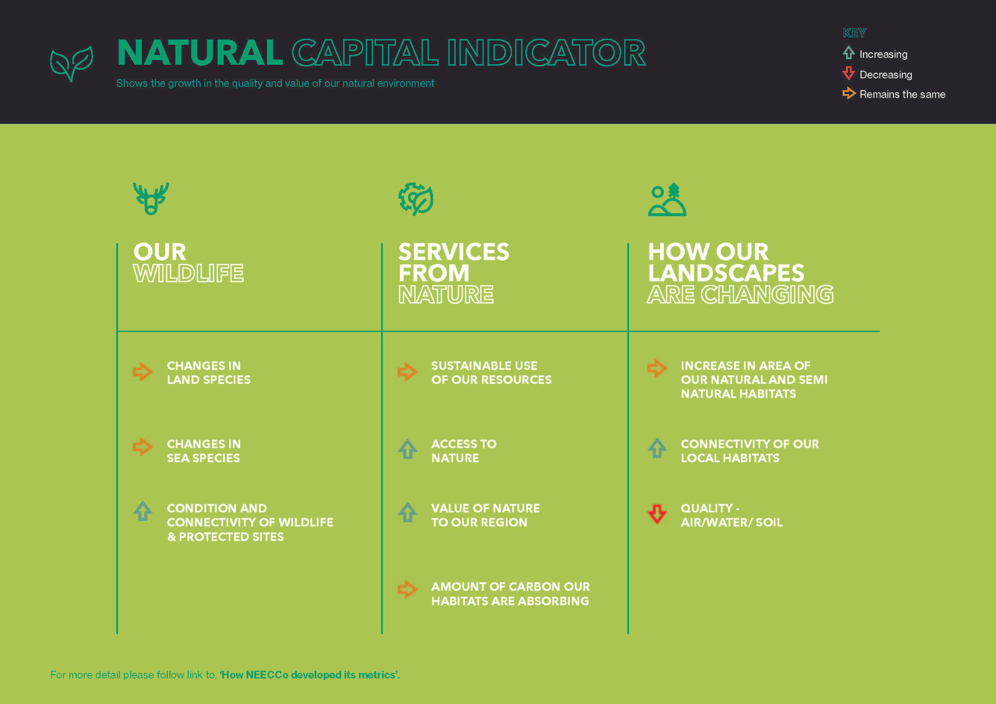
Image: Mockup of Indicators Project dashboard. Credit: NEECCo.
Image credit: Canva
Data science tools and techniques
The project utilised data science to consolidate and present data effectively.
The hackathon played a significant role in refining the data presentation, with contributions from the Analysts Network North East and the National Innovation Centre for Data.
Data Visualisation and Interactivity
For the visualisation and interactivity component, the Plotly Dash platform was used. Dash is a python framework for building analytical web applications, composed purely in Python with no JavaScript required.
Data Preprocessing and Analysis
- Python notebooks served as the interactive computing environment.
- The Pandas library was utilised for data preprocessing and analysis.
- GeoPandas, an extension of Pandas was used to facilitate handling of geospatial data, as well as Folium.
Deployment
During the development, Azure Web App Service was used to allow hosting and manage the dashboard web app at scale. The cloud service was chosen for its ability to integrate existing workflows and for its robust management, security, and compliance features.
The dashboard was containerised using Docker, which ensure the app could run reliably in different computing environments.
Finally, Gunicorn served as the interface between the web app and the web server.
Using these tools and techniques enabled the creation of a dashboard that not only met the initial project requirements but also provided a platform that can evolve over time with the addition of new data, indicators, and visualisations.
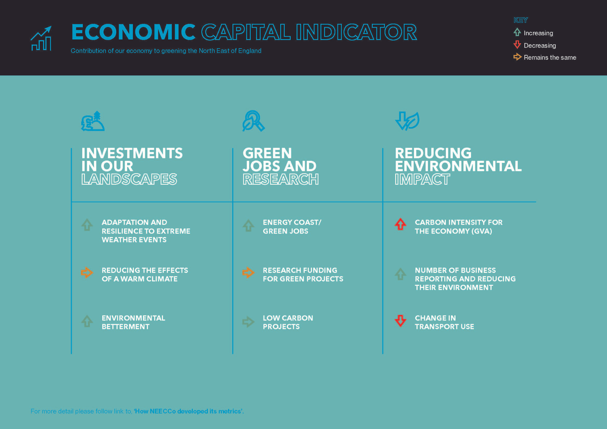
Image: Mockup of Indicators Project dashboard. Credit: NEECCo.
Business impact
The partnership with NICD was pivotal due to their expertise in data handling. The project's success has been recognised by local authorities and may pave the way for future initiatives.
"In five years' time, our hope is that we will have helped the eclectic range of voluntary organisations within the region engage with climate change".
Chris Ford, Consultant, NEECCo
NEECCo now has an extendable platform to add new indicators, update existing ones and a conversation that is accessible to the public.
"The tool is for helping all of us engage with the most critical issue that we face and supporting people to make informed choices and changes in their behaviour. The question now is how do we use it for public engagement? That is the next phase. If we did not have this tool, we could not have moved forward.”.
Chris Ford, Consultant, NEECCo
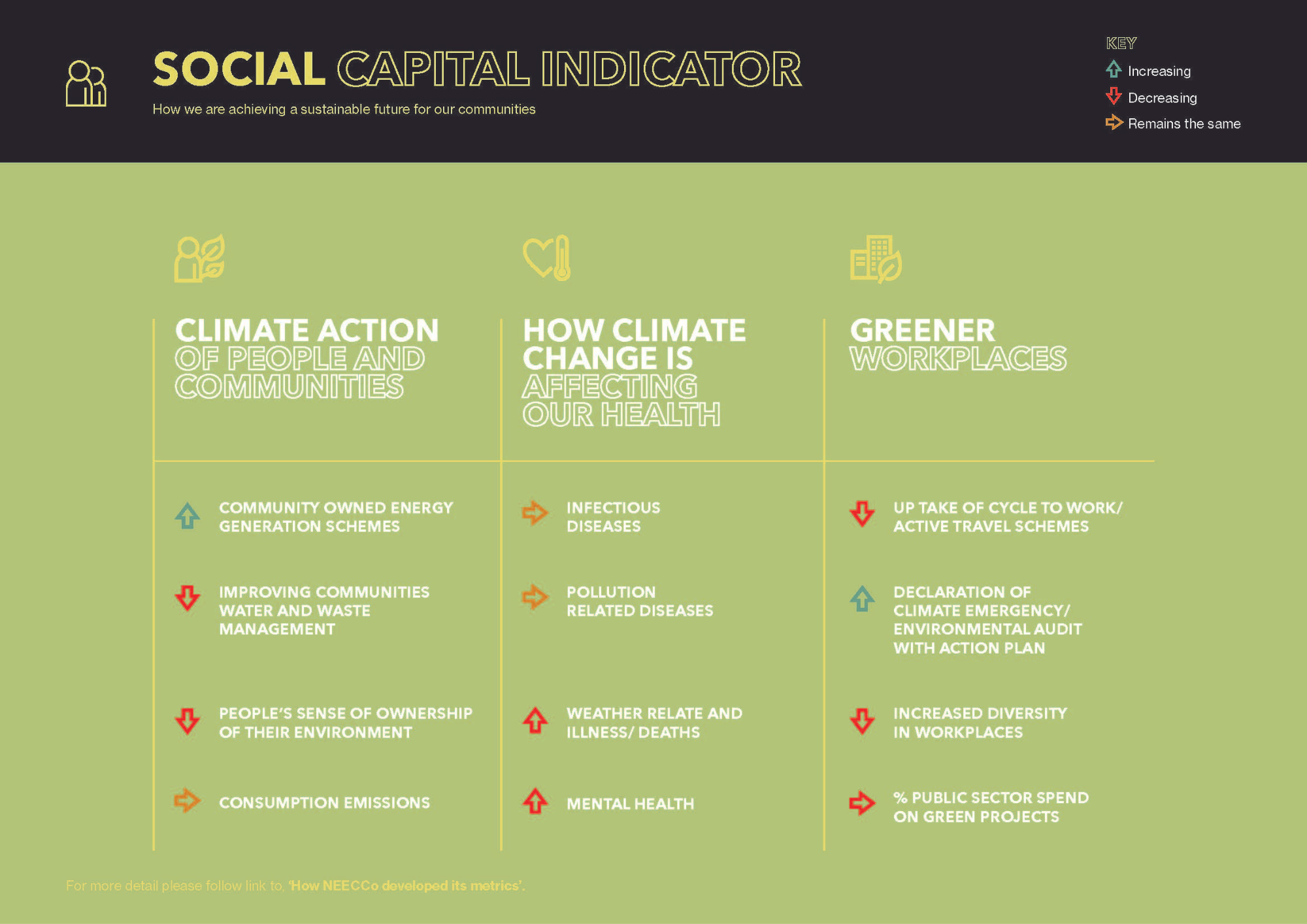
Image: Mockup of Indicators Project dashboard. Credit: NEECCo.
Working with the National Innovation Centre for Data
The impact on NEECCo was multifaceted. The resulting dashboard emerged not just as a tool, but as a platform for dialogue and awareness, embodying the organisation's mission to foster informed community involvement in environmental sustainability.
Since early 2024, NEECCo’s work is being taken forward by two Local Authority led subregional partnerships – one covering Tees Valley, the other covering the new North East Mayoral Combined Authority.
The dashboard is now held by Going Green Together, which is part of VONNE the regional support body for the voluntary, community and social enterprise sector. VONNE initiated NEECCo, so there is a certain symmetry.
"The indicators dashboard is an extendable platform to which we can add new indicators and update existing ones. It is also a conversation starter that can help us all make informed choices and changes, as we address the defining challenge of our generation." Chris concluded.
The collaboration's success—cemented unwavering support from the technical team, particularly Peter Michalák— demonstrates how aligned interests and a shared commitment to a cause can lead to remarkable outcomes. "Many, many, many thanks to him—we simply couldn't have done it without him," said Chris.
"Working with Chris on this dashboard project was a great opportunity to dive deep into the climate domain, and explore the vast amount of indicator data available. Collaborating with Chris was exceptionally positive; his dedication and expertise could be felt each time he met with the NICD team. I particularly enjoyed Chris sharing climate-related stories from the region. It’s wonderful to see the dashboard being available for the public to engage with."
Dr Peter Michalák, Senior Data Scientist, National Innovation Centre for Data
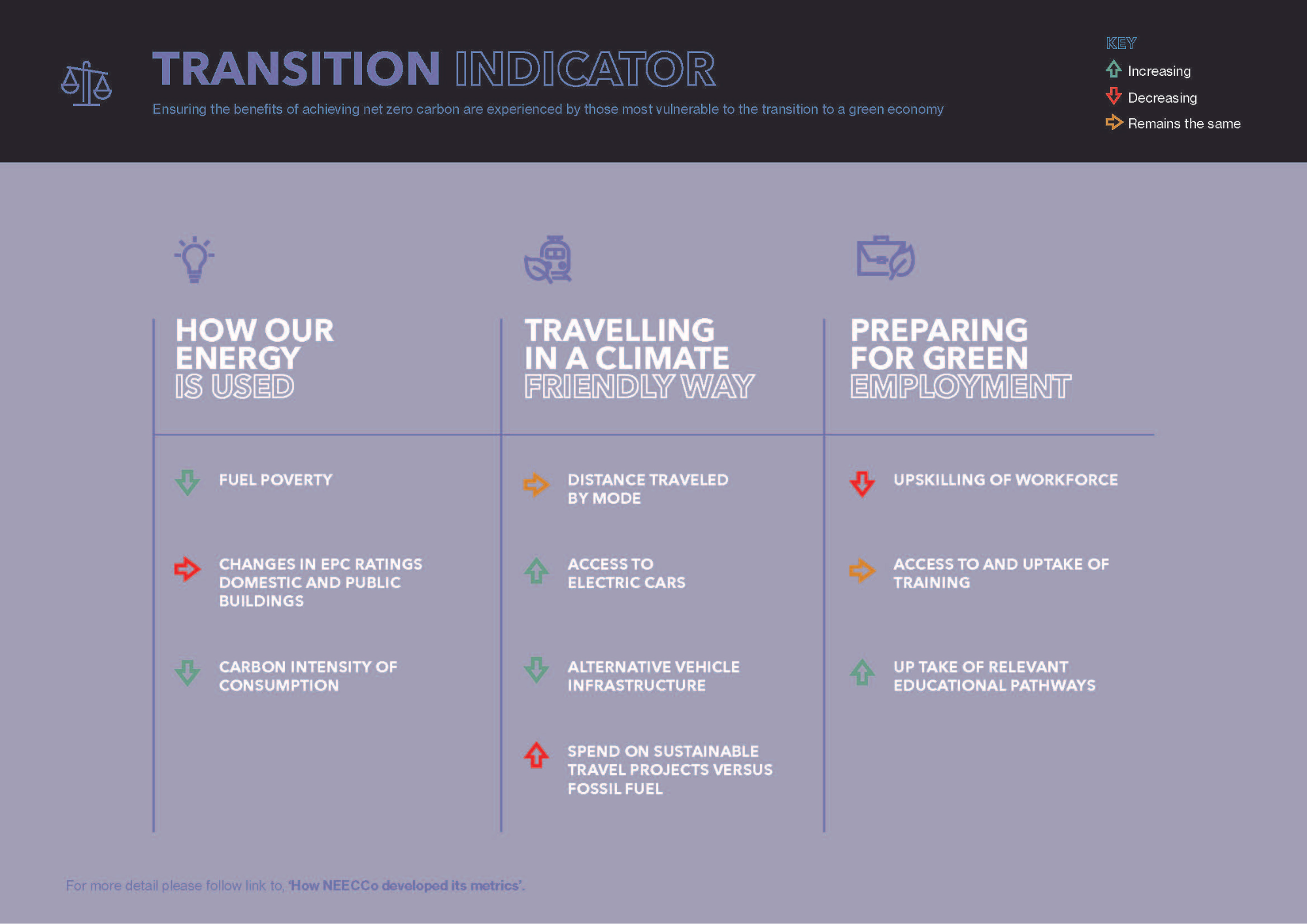
Image: Mockup of Indicators Project dashboard. Credit: NEECCo.
To find out more about Going Green Together (incorporating NEECCo's Indicators Project), visit their website.
You can read more of our case studies and sign up to our newsletter to keep up to date with our latest news, events and developments.

Our Discovery workshop
Our Discovery workshops enable you to explore the potential of your data and understand the benefit you could gain before committing to a full-scale project.